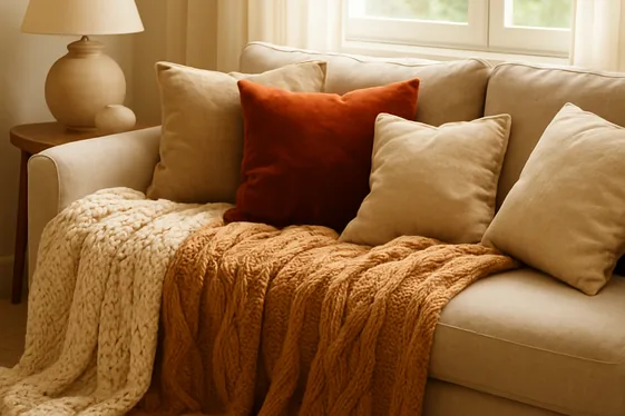
Creating a living room that feels calm and modern can be as simple as choosing the right color palette. Neutral colors have become the go-to choice for homeowners who want timeless elegance without overwhelming their space. They offer versatility, making it easier to match furniture, décor, and accents while keeping the ambiance peaceful.
Whether you’re starting fresh or refreshing your current living room, understanding the subtle differences among neutral shades can guide you in creating a room that’s both inviting and stylish.
In this guide, we’ll explore 14 neutral living room colors that balance serenity with modern style. Each color has its own unique personality and effect, helping you find the perfect tone that suits your space and personal vibe. From warm beiges to cool grays, and creamy whites to gentle taupes, these choices offer a fresh perspective for your living room makeover.
Stick around for ideas, styling tips, and advice on picking what works best for your home in 2026 and beyond.
1. Soft Greige: The Best of Gray and Beige
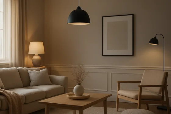
Soft greige finds a sweet spot between gray and beige, offering a balanced neutral that works beautifully in living rooms. It brings the coolness of gray together with the warmth of beige, creating a cozy yet sophisticated backdrop. Unlike stark grays that can feel cold, or beiges that sometimes lean too warm, soft greige gives you a calm and versatile canvas.
Think of walls painted in a soft greige tone paired with natural wood furniture and plush textiles in varying textures—it creates depth without overwhelming your space. Lighting makes a big difference with soft greige.
In natural light, it leans warmer, but under artificial lighting, it can pick up subtle gray undertones, adjusting the mood as the day goes on. For a modern feel, match your greige walls with white trim and matte black accents. This combo keeps the room feeling fresh and inviting.
Be mindful that not every greige shade goes with all undertones, so test a few samples on your walls before committing. Soft greige really shines in rooms where you want calm, comfort, and style to coexist seamlessly.
2. Warm Taupe for a Cozy Feel
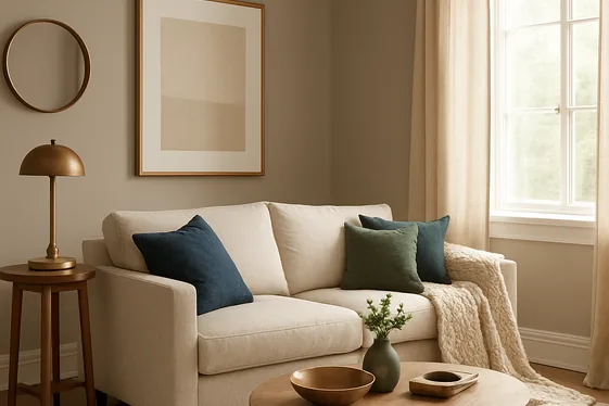
- Warm taupe strikes a balance between beige and gray, offering a soft, inviting backdrop that complements a wide range of furniture styles. It lends a grounded, earthy vibe without feeling dull or overpowering.
- Pair warm taupe walls with white or cream trim for a crisp, clean contrast that highlights architectural details beautifully. This combination keeps the space feeling bright and airy.
- Layer textures like a chunky knit throw, linen curtains, or a sisal rug to enhance the cozy mood that warm taupe encourages. These tactile elements play well against the color’s gentle warmth.
- Add pops of deep navy or forest green in pillows or art to create visual interest while preserving the room’s calm, collected energy. Neutrals don’t have to be boring!
- Warm taupe works wonderfully with natural wood accents—think walnut coffee tables or bamboo side chairs—as their honey tones resonate with taupe’s warmth.
- Opt for warm metallic finishes such as brushed bronze or antique gold for lighting and hardware; these tones harmonize smoothly with taupe and add subtle luxury.
- If natural light is limited, warm taupe can reflect what little sunlight your room gets, making the space feel cozier rather than cramped or dark.
Warm taupe brings a quietly comforting foundation that helps a living room feel lived-in and inviting without sacrificing style. I’ve seen this work well in many cases, especially in open-concept homes where the warm tone draws different areas together for a consistent, calm vibe.
It’s a color that ages gracefully too, adapting easily as your tastes and furnishings evolve over time.
3. Classic Creamy White: Timeless and Bright
Quick Tip:
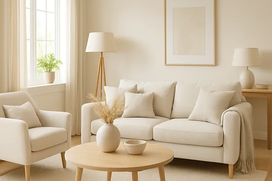
Choose a creamy white paint with warm undertones to keep your living room feeling inviting and bright without harshness. Pair it with natural wood accents and soft textiles in beige or light gray to add texture and dimension. Avoid stark, pure white shades, which can feel cold or clinical in a cozy space. A creamy white backdrop lets your furniture and décor pop while maintaining a timeless, airy vibe.
Classic Creamy White gives your living room a fresh, open feel that never goes out of style. It reflects natural light beautifully, making small spaces appear larger and more welcoming. This shade creates a perfect canvas to mix and match colors, from bold cushions to soft rugs.
Because it leans toward warmth, it avoids the chilliness common with pure white while keeping the atmosphere calm and modern. It’s ideal for homeowners craving a bright yet cozy environment that adapts as trends change.
4. Muted Mushroom: Earthy Elegance
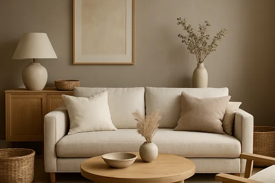
Before: The living room felt cold and stark, with walls painted in plain off-white that lacked personality. Furniture and décor didn’t seem to connect, creating a space that felt disjointed and uninspired. It was hard to imagine relaxing here when the room felt so bland and unfriendly.
After: Muted mushroom tones transformed the living room into a soothing retreat grounded in earthy elegance. The warm gray-beige walls tied the furniture and accents together without overwhelming. Natural textures like linen pillows and wooden elements blend seamlessly, making the space feel inviting and perfectly balanced.
Muted mushroom strikes a beautiful balance between gray and beige, offering a soft, neutral backdrop that brings subtle warmth to your living area. This shade gives your room character without clashing with your existing décor, especially when paired with natural materials like rattan baskets or oak coffee tables.
It’s a quiet color that elevates your space effortlessly—ideal when you want a calm vibe but dislike starkness or cold tones. Consider painting walls and even trim in muted mushroom for continuity, then layer in creams and soft browns for a cozy yet modern look.
5. Cool Dove Gray for a Sleek Look
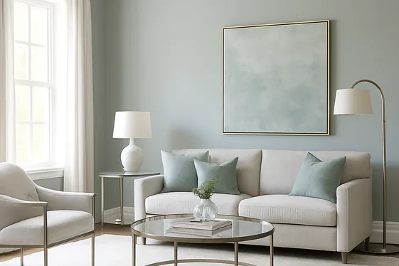
- Start by selecting a cool dove gray paint with subtle blue or green undertones. This helps maintain a fresh, sleek vibe rather than a dull or flat gray. Test samples on different walls to see how natural light affects the shade throughout the day.
- Pair your dove gray walls with crisp white trim and ceiling. This contrast sharpens the room’s edges and enhances the modern look. Choose a glossy or semi-gloss finish for trims to add a touch of polish.
- Incorporate furniture and decor in a mix of textures like brushed metal, glass, and soft linens. These materials blend beautifully with cool dove gray, creating depth and interest without overwhelming the calm palette.
- Place a large area rug in a neutral tone such as ivory or soft taupe to ground the space. This adds warmth and prevents the room from feeling too cold or sterile. Opt for a rug with a subtle pattern to add character.
- Introduce pops of color through small accessories like throw pillows or artwork, focusing on muted blues or greens. These accent hues complement dove gray while keeping the room’s serene atmosphere intact.
Cool dove gray offers a sophisticated backdrop that feels both airy and grounded. In my experience, this shade keeps living rooms looking effortlessly chic without sacrificing comfort. It’s especially well-suited for rooms with plenty of natural light, where the soft cool undertones can really shine.
The key is balancing textures and subtle accents to avoid a monochrome effect that feels bland.
6. Subtle Sand: Light and Airy Neutral
| Point | Off-White Walls | Subtle Sand Walls |
|---|---|---|
| Brightness | Very bright, can feel stark | Warm, light, more inviting |
| Mood | Crisp, clean but sometimes cold | Soft, airy with a peaceful tone |
| Furniture pairing | Works best with cool-toned wood | Complements warm woods and linens |
| Maintenance | Shows dirt and scuffs easily | Hides minor marks better |
| Versatility | Classic, pairs well with all colors | Adds warmth but still neutral |
| Space feel | Makes rooms look larger | Feels spacious with a cozy touch |
| Natural light | Reflects a lot of light | Filters light softly for calmness |
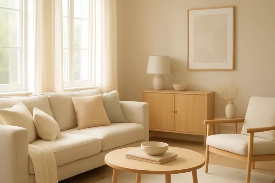
Subtle Sand blends light with a whisper of warmth, creating a tranquil, airy backdrop that feels gentle on the eyes. It softens the room without sacrificing brightness, making it great for living areas where you want calm yet inviting vibes. Pair it with light oak furniture and textured fabrics in soft creams or pastels for a layered, modern look.
Unlike stark off-white, it hides everyday wear without dulling your space, keeping your room feeling fresh and easygoing. If your space gets lots of natural light, Subtle Sand will tone it down just enough to avoid harsh glare but still keep things cheerful.
7. Gentle Putty: A Versatile Background
Do:
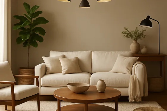
- Pair Gentle Putty walls with warm wood tones to deepen the room’s coziness.
- Use natural fabrics like linen or cotton in beige and cream shades to complement the putty color.
- Add statement lighting in brass or matte black to create contrast and interest against the subtle backdrop.
- Incorporate plants with rich green hues to bring freshness and life to the neutral canvas.
- Layer textures such as woven baskets, plush rugs, and soft throws to avoid flatness in the room.
Don’t:
- Rely solely on white trims or stark colors next to Gentle Putty, as this can make the space feel clinical.
- Overcrowd the room with too many bold colors that compete with the subtle tone.
- Use gloss finishes on furniture or walls, which can clash with the soft matte feel of Gentle Putty.
- Ignore lighting—this shade works best with plenty of natural or warm artificial light.
- Skimp on accent pieces; too few can make the room look unfinished and dull.
Gentle Putty acts as a wonderfully adaptable background, almost like a soft whisper rather than a shout. Its muted brownish-beige tint allows it to blend seamlessly with many textures and materials, making it an ideal base for layering in other neutrals or soft hues. In living rooms, this color creates a calm and approachable atmosphere, especially when balanced with warm woods and natural elements.
The key is to keep the space feeling inviting by mixing textures and thoughtfully placing accent pieces that enhance rather than overpower the delicate earthiness of Gentle Putty.
8. Warm Almond for Inviting Spaces
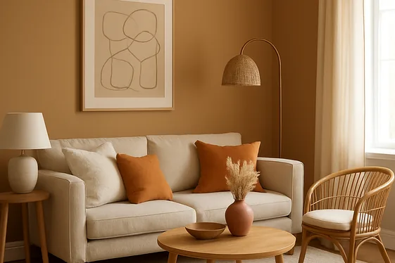
Cost: Moderate
Time: A weekend project
Skill Level: Beginner to Intermediate
Best For: Cozy, inviting atmospheres
Warm almond tones bring a soft, earthy glow that instantly makes living rooms feel inviting without overwhelming the senses. This creamy beige shade with subtle hints of caramel and tan creates a backdrop that’s both modern and comfortably familiar. It works well with natural textures like wood or rattan, enhancing a space’s warmth while keeping things neutral and light.
Pair warm almond walls with off-white trim and soft ivory furnishings to maintain a bright, open vibe. Whether you add in deeper browns or rusty oranges through accents, it’s a soothing color that encourages relaxation and friendly conversation—great if your living room is a hub for family or guests.
9. Light Mocha: Rich Yet Neutral
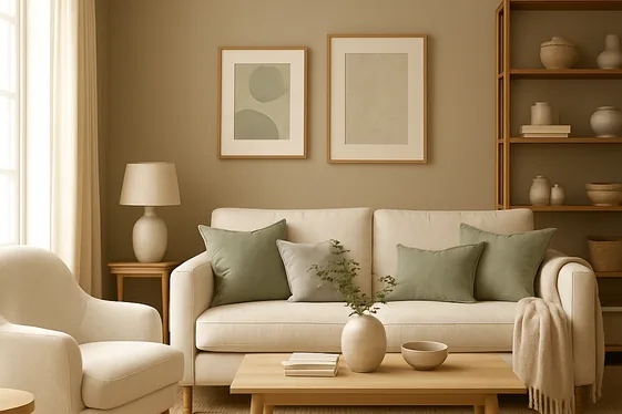
Light mocha strikes a balance between warmth and neutrality, making it an ideal choice for living rooms that seek a cozy yet understated vibe. This shade combines soft brown tones with subtle hints of beige, offering a rich backdrop without overpowering the space. In my experience, pairing light mocha walls with off-white or cream-colored furniture creates an inviting atmosphere that feels sophisticated but not stuffy.
It’s particularly well-suited for rooms with lots of natural light, as the warm undertones come to life without feeling heavy. Layering textures can enhance light mocha’s appeal—think linen curtains, woven rugs, or wooden accents in lighter finishes. I’ve seen this work well in many cases where homeowners integrate pops of muted greens or soft grays through throw pillows or artwork, adding depth without breaking the calm vibe.
If your living room features open shelving or built-ins, consider staining them in warm wood tones that harmonize with light mocha’s richness. Quick Tip: Avoid overly dark furniture that might clash; instead, lean toward mid-tone woods or neutral upholstery to keep the space feeling balanced and modern.
10. Pale Stone: Soft and Sophisticated
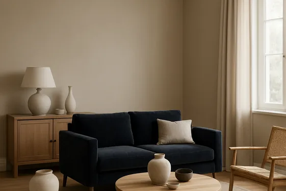
- Pale Stone is a gentle, muted beige with subtle gray undertones, giving it a soft, sophisticated vibe. It’s a fresh alternative to plain off-white, adding warmth without overwhelming the space.
- It pairs beautifully with natural wood finishes like oak or walnut, creating an inviting, earthy feel. Balance it with darker accents like charcoal or deep navy for contrast and depth.
- Walls painted in Pale Stone reflect light softly, brightening rooms without glare. It works especially well in living rooms with large windows or minimal artificial lighting.
- This color complements both modern and traditional furniture styles. A velvet sofa or linen curtains in warm neutrals will amp up the cozy factor.
- Textured accessories like woven rugs, linen throws, or ceramic vases add dimension and keep the neutral palette from feeling flat. Mix finishes—matte, glossy, and rustic—to keep it dynamic.
- Pale Stone adapts well throughout the day, shifting from warm caramel tones in sunlight to cooler stone grays in the evening. This makes it ideal for rooms used at all hours.
- Keep the trim and ceilings crisp white or soft cream to frame the space and highlight architectural details without competing with the Pale Stone walls.
This color strikes a balance that’s hard to beat: soft enough to feel calming yet sophisticated enough to elevate a modern living room. Pale Stone’s quiet elegance invites layering textures and accents, making your living space feel thoughtfully designed but effortlessly comfortable. It’s a smart choice if you want a fresh neutrally toned backdrop that never feels boring or cold.
11. Blush Beige: A Hint of Warmth
Quick Tip:
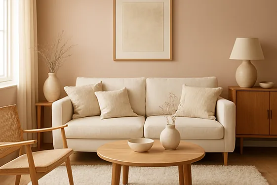
Blush beige softens a room with its subtle rosy undertones, creating a welcoming sense of warmth without overpowering your space. Pair it with creamy whites and warm woods to balance quiet elegance with cozy vibes. It plays well with textures like linen cushions or a fluffy rug to add depth and interest.
Blush beige offers a gentle touch of color that lifts neutral rooms out of the ordinary. Its warm, muted pinkish tint keeps things calm but adds life beyond standard beige. Think taupe on a sunny wall with blush beige accents in throw pillows or curtains—it brightens the room while maintaining a relaxed atmosphere.
This shade works wonderfully in living rooms with natural light, softening shadows and blending effortlessly with mid-century modern or Scandinavian furniture styles. If you want understated warmth, blush beige is a quiet but confident choice.
12. Smoky Greige: Modern and Moody
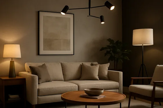
Before: Many living rooms feel uninspired with overly beige or pale neutrals that wash out the space and lack personality. This can make the room feel flat and uninviting, especially in homes with minimal natural light. It’s tough to create a cozy, modern vibe when the color feels washed out.
After: Introducing smoky greige transforms the living room with a rich, modern moodiness that still reads as neutral and calming. The perfect blend of gray and beige tones adds depth without overwhelming the space, making it feel sophisticated and grounded. Paired with warm wood accents or metal details, this color creates a balanced, inviting atmosphere that works day or night.
Smoky greige strikes a refined balance between cool and warm, making it versatile for various décor styles. In my experience, it’s ideal for homeowners who want a neutral that doesn’t feel boring but still provides a calming backdrop for furniture and artwork. The subtle depth helps hide minor wall imperfections too, so you won’t need constant touch-ups.
To maximize the effect, try painting three walls in smoky greige and leaving one accent wall a charcoal or soft black; this adds drama without dominating the room. Remember, lighting plays a big role here — layer lamps and dimmers so the color changes mood effortlessly throughout the day.
13. Light Linen: Breezy and Natural
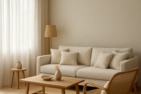
- Choose a light linen paint or wallpaper shade with subtle beige or greige undertones to keep your walls fresh without feeling cold. Avoid stark whites to preserve the natural vibe.
- Incorporate linen-textured fabrics for curtains, upholstery, or throw pillows in soft creams or natural tans. These fabrics add gentle texture while staying true to the breezy aesthetic.
- Layer in natural materials like wood, rattan, and jute through furniture pieces and accessories. Their organic textures complement the airy linen base and create warmth.
- Keep your furniture lines simple and modern, with minimal ornamentation. Clean silhouettes balance the laid-back feel with a fresh, contemporary edge.
- Use plenty of daylight to amplify the natural tones. Position seating near windows and opt for light, sheer window treatments to maintain unobstructed sunlight.
Light linen evokes an easy, breezy atmosphere that’s both calming and inviting. It’s ideal for those who want a modern look that feels down-to-earth and connected to nature. The neutral yet airy undertones bring softness and subtle warmth, giving living rooms a light, open personality.
Pairing it with natural textures and a focus on daylight highlights the effortless charm linen offers, creating a space that welcomes you to relax without fuss. Just remember, the key is in balancing softness with structure for an updated, natural retreat.
14. Soft Pebble: Calm and Contemporary
| Point | Traditional Beige | Soft Pebble |
|---|---|---|
| Shade | Warm, yellow undertones | Cool, subtle gray undertones |
| Mood | Cozy, classic | Calm, modern |
| Versatility | Works with warm palettes | Pairs well with cool and warm |
| Light Reflection | Reflects warmth | Creates a soft, muted glow |
| Complements Wood | Cherry, oak | Walnut, ash |
| Best Room Size | Larger rooms | Small to medium spaces |
| Decor Style | Traditional or rustic | Contemporary or minimalist |
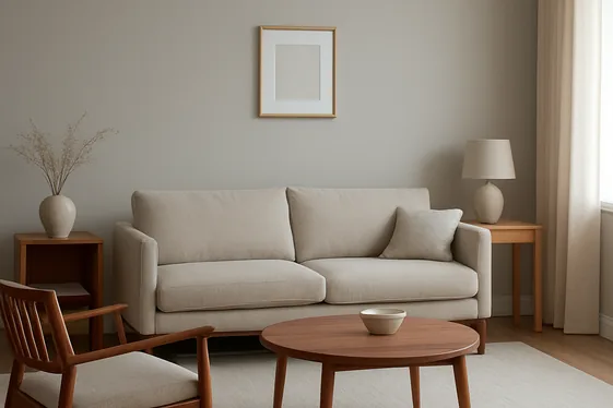
Soft Pebble brings a soft, grayish hue that feels fresh without being cold. It sends calm vibes into your living room, blending seamlessly with natural wood tones like walnut or ash. Because it’s a bit cooler, it balances out bright sunlight and creates a gentle, restful atmosphere. Unlike traditional beige, which leans warmer and can feel more dated, Soft Pebble adds a sleek, modern touch while keeping the space neutral.
Perfect for medium or smaller rooms, it plays nicely with a broad range of furniture and décor styles. Give your living room that quiet, up-to-date elegance by inviting Soft Pebble into your color scheme.
Conclusion
Choosing the right neutral living room color is all about matching your vibe and space needs. From soft greige’s versatile appeal to warm almond’s cozy invitation, these 14 options provide a wide range of calming, modern styles. Some colors like smoky greige or cool dove gray lean into sleek sophistication, while warm taupe and blush beige offer comfort and subtle warmth.
Consider your lighting, furniture, and lifestyle when selecting a color that not only enhances your space but makes you feel right at home. Remember, a neutral doesn’t have to be boring—it’s the perfect backdrop for your personality to shine through. Take your time experimenting with samples and see which tone makes your living room feel like your personal sanctuary.

Sarah Parker is a creative content writer with experience in crafting engaging, reader-friendly, and SEO-optimized content. She specializes in writing blog posts, website copy, social media captions, and digital marketing content across niches including lifestyle, home decor, business, and technology. Her writing style focuses on clarity, audience engagement, and search engine visibility.